
11.04.2021
Political Email Marketing: Essential Tips for Your Email Campaigns

Most of our political leaders use either pretty conservative channels (TV, official press releases, offline meetings) or social media to communicate with their audience. But sometimes the audience needs sophisticated content, digests, and detailed notifications. In this case, parties can use email marketing.
The process of setting up an email campaign for a political party differs from regular email marketing. The sending terms are different and the global situation also plays its role.
Today, we are going to examine how various political parties in the USA and Europe set up their email campaigns. We will be discussing it neutrally, without adhering to any political position. If we criticize the email channel of a party, this doesn't mean we criticize its course. Even if the EmailPacifists party has wonderful campaigns, we will compliment them (and deal with them a bit later, you know).
Before we start, we need to identify several common features that any party will face if it decides to launch an email campaign.
Many ESPs Are Not Going To Be Happy To See You
ESPs aren't really into folks who do gambling, microloans, and politics. These are dangerous areas from the reputational point of view - the platforms trace the reputation of the IPs used to send campaigns. If the campaign gets reported as spam, the score of the IP falls down and it influences the campaigns of other companies, which send emails from the same IP. The opponents can report the political party even if the campaign was made according to the rules.
Such attacks influence the deliverability of emails in a bad way. It is one of the reasons why political parties can face problems when choosing an ESP.
All of these terms are stated in the privacy policy of the platform. So, it's either better to read the not-to-do list before choosing a service or to consult a manager.
ESPs often state that creating campaigns from political parties is okay, but political propaganda is not. In such cases, it's better to be on the safe side and look for a platform with more free views on politics, as any political party campaign may be regarded as propaganda.
Nearly any big enterprise platform with lots of features doesn't have such restrictions. But this option won't probably suit most of the players. Even big parties' email marketing is not developed as much to overpay for the sole opportunity to send emails and for some unnecessary mechanics. However, the situation is not as bad as it may sound - we still have enough platforms to cooperate with.
This service does not directly forbid politics, but strictly traces reputation and complaints, especially in the first stage. They have a ban system in place for every case possible, so you'd better keep order in your campaign: the base should be subscribed and loyal, emails should have useful and relevant content. Actually, these are the rules for any platform.
The rules regarding senders are rather soft here. But it's also a weak point — lots of clients complained that their emails got into the spam folder because of low IP reputation. Now Sendgrid is fighting this: for example, they've set up additional authentication when signing up and logging in to ban unscrupulous senders.
A service for trigger campaigns. Experience has proven that it also suits politicians well. The thing is, this is not a traditional ESP. It is designed exactly for triggers that are sent by requests. But if your campaigns are not complicated from a technical point of view, there should be no problems.
Donald Trump is expressive both on social media and in real life. His newsletter is no exception. It's emotional and sometimes even aggressive. The sender's name always changes, but the combative tone is in every email.

In this email, Donald Trump's presidential campaign manager sends a confidential pre-election strategy with a secret survey. This is probably a manipulation: we know that the person who received this email has never subscribed to Donald Trump's newsletters. And all of a sudden they get a confidential strategy.
Sending a newsletter to the non-subscribed base is the worst thing you can do for your company and email channel. If we are talking about politics, this move will be God's gift to your opponents, as there may be people from the opposing camp among the non-subscribed. These folks will probably take the effort and try to sue you and they will be right. If I get a bulk newsletter it means I've subscribed to it. This is illegal without a person's consent.
The emails from Donald Trump's marketing team consist of text and tables. They don't have any graphic elements and it's okay for a political newsletter. But when any graphics show up it looks really sloppy.

Look at the answer options. An ordinary user will notice that there are no negative options, which means there will be no adequate feedback from the audience. Email marketers will pay attention to the points being made in the form of radio buttons that work practically nowhere. They won't work here either: the UI presupposes that the user chooses an answer and clicks the button. In fact, every option is a link. One and the same link, by the way.
The footer of an email is usually used to place contacts, social media buttons, and an unsubscription link. A part of this list is present in Donald Trump's marketing team emails, but even their footer is big and packed with information, CTA's, and campaign slogans: it takes almost as much space as the rest of the text.

What is rather uncharacteristic of a footer is lots of subscription options. You can do it via SMS or even become a volunteer.

But the footer has no unsubscription links. They must be there if you are sending a legal newsletter. Add this to the fact that a person hasn't subscribed to the newsletter and you will get a ton of spam reports.
The footer also says that Donald Trump has left a personal message for his TOP supporters. If it is true, then the footer is not the best place for this message. On the other hand, we know that the person who got this email hasn't subscribed to this newsletter. So the chances of them being one of Trump's top supporters are pretty low.
As a matter of fact, there's a great sum of exclusive offers in this newsletter. For example, here is an email personally from Donald Trump's son with an exclusive offer for the most active supporters:

On one hand, a newsletter directly from a politician should build trust. On the other hand — we all understand that a busy big-time politician is unlikely to sit and type this email personally. There is a fine line to this move, both in regular and political newsletters.
You can place a political leader as a sender if they communicate with the audience directly. However, it's doubtful that the head of the country would personally write you an email and address you by your first name. In such cases, it's better to send an email from the head of the marketing team or of the pre-election campaign. The problem with Trump's newsletter is that it has too many senders. Only in the emails we received, we can see that they come from:
Such pressure may be confusing. It's also interesting that in one of the emails we can see a changed footer. It's way smaller, neater, and has an unsubscription link.

This email looks a bit less sloppy than the other ones. It was probably made by another team, as emails with no unsubscription link still came even 50 days before the election day.
1. Subscription
NEVER send a newsletter to non-subscribed people. If you are making a newsletter for a politician or a political party, throw this move out of your guidebook. It will do nothing but damage to your reputation and domain. Place the subscription button on the website, sharing the news of the party and announcing the upcoming events. You can send interesting political content from like-minded people. Every email must contain an unsubscription link. If there is none, your newsletter can be regarded as illegal and deemed to be spam.
2. Surveys
It's better to conduct surveys using special forms, for example, Google Forms or Survey Monkey. You can just provide a link to the form in an email, as there's not much interactivity in emails, and AMP is not supported on every platform.
3. Tone of Emails
It's difficult to judge an aggressive style of emails. Maybe it's just the thing for your target audience. But it will clearly alienate someone. There are a number of offers in the newsletter that attentive users will qualify as manipulative. We believe it's better to avoid this — especially when it comes to political marketing. Voters' trust is more valuable than Click Through Rate.
Users are addressed with the help of text, graphics, and some design. Everything looks neat and structurally the email resembles a newsletter. It has a nice footer with social media links and an unsubscription link. Donate buttons are placed in two columns — they take fewer scrolls this way.
The tone of the newsletter itself is more of an open than a personal letter. The whole group is addressed in the email — 'folks', not a sole subscriber. It's a good option: practically no one will believe that the marketing team's CEO is writing an email personally.

Sometimes the sender's name changes — in this case, the person is introduced at the beginning of the email. Their photo is present together with a complimentary speech.

Biden's newsletters either inform or gather donations.
1. The Main Element
Nearly every newsletter begins with a common element — something of a logo. Sometimes this logo changes, but the newsletter always begins with it. Often it's too big. Emails are adapted to mobile devices, but because of a big starting logo, it's difficult to understand what this email is about if opened on a mobile device. The whole first screen will be covered with the starting picture and a person's photo.

The starting logo can be resized so it doesn't take up so much space. You can also add the main banner with a slogan that reveals the email's essence as they often do in commercial newsletters. Later in this article, we'll see that European political parties always use banners in their newsletters.
2. Sender's Photo
The sender's photo is too big and doesn't look informative on a mobile device. On a desktop it leaves giant white spaces on the right. We can create a block with the photo on the left and some short information about the person on the right. It will make the block more informative, fill out the white space and make the email more readable. But the text should be really short for the blocks not to rearrange on a mobile device. This way the person will see all the information on one screen.
Let's quickly check the parties from other countries.
An organization protecting animals in Australia. They have surprisingly good and pleasantly looking emails. On one hand, they're bright enough, and on the other — they're easy to read.
A common mistake of those who want to create an eye-catching email is the abundance of colors. The email becomes a clown's suit. But here are a few bright colors and they're not out of place.

The complaints go to the size of the email: it's so big that it's difficult to highlight the main point. This email is not typical of this organization — it's unlikely to shorten the content. But we can change the design so it becomes shorter. Typically emails of Animals Australia look more modest:
Organizations that live on the users' donations should never cross the line. They should avoid annoying the users while still getting donations. You should be modest when asking for a donation, but placing the Donate button after the footer and especially after the unsubscription link is way too modest. It breaks the structure and logic of the email. As the email is not aggressive and might interest the supporters of the organization there is nothing bad about asking for a donation after the article or the author's words.
All in all, their newsletter is good. It's informative, reads well, and is soft-sell. The reader is addressed by the first name, which is also fine for such organizations.
"Bruno Leoni Institute" is a libertarian research center. Its campaigns can be divided into two types:
Invitations look like this:
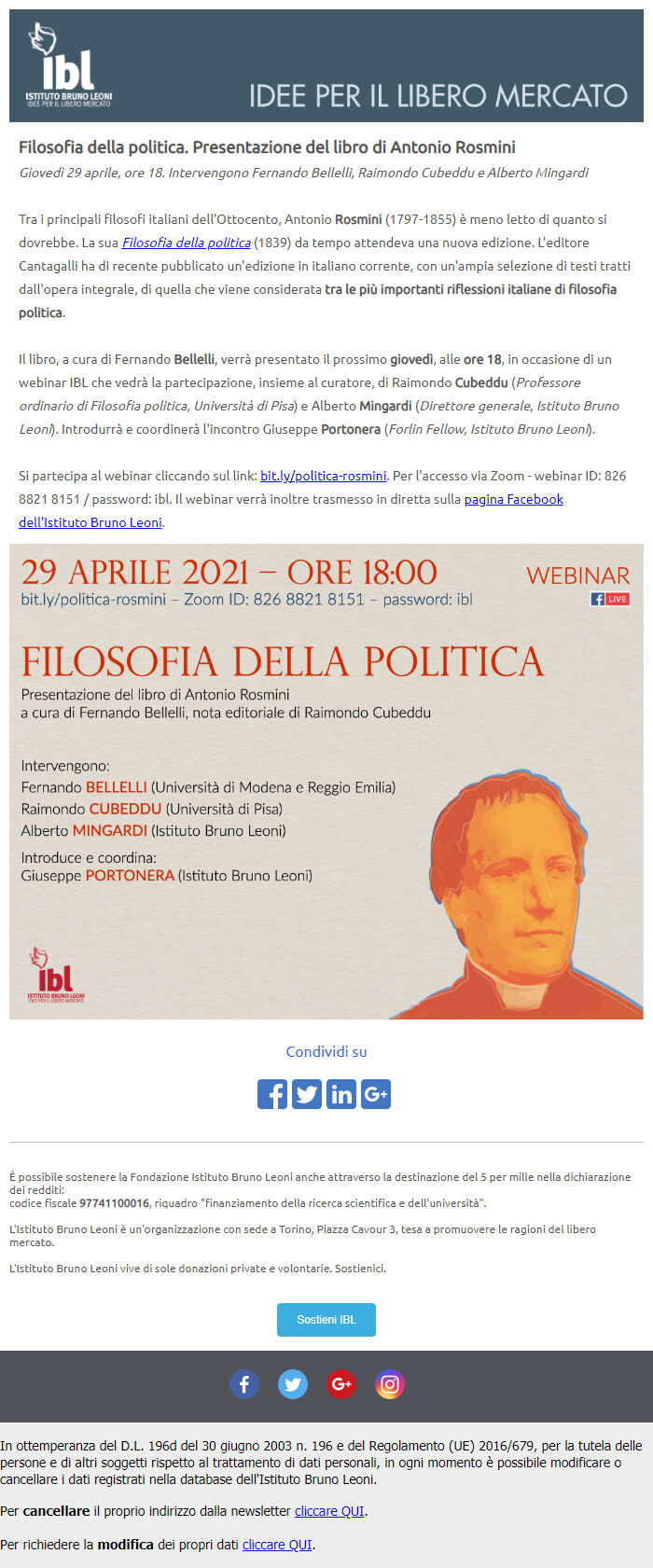
The email is very chaotic. There is no headline for an eye to catch. The formal headline is only slightly bigger than the main text. The eye catches the colossal banner at the end of the email. Most users will probably just scroll to the banner.
CTA is there, but it is lost as it comes right after the first footer. Yes, there is also the second footer, which may look like a sending bug: some platforms add a footer with an unsubscription link in case you didn't paste it. It seems like this case as the first footer doesn't have the link and the second — does.
Another type of emails looks this way:
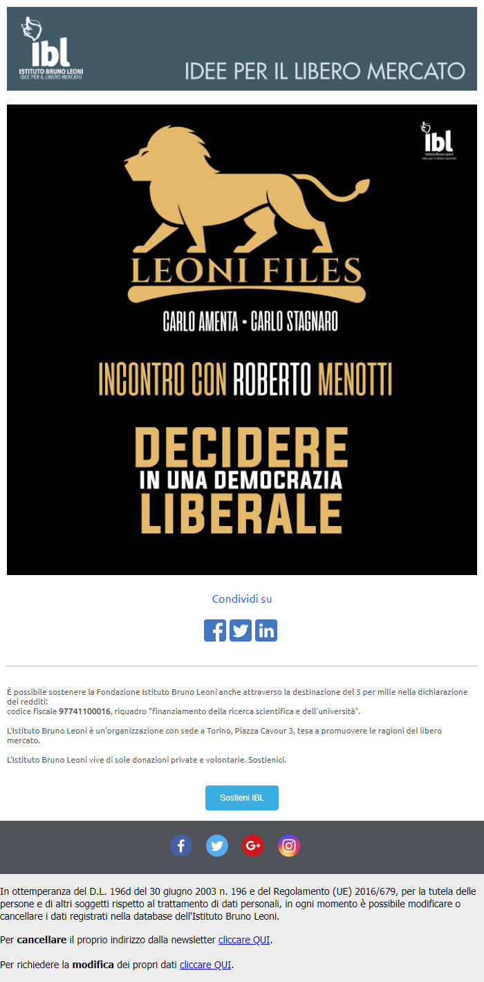
It's better in general, but there are two footers again. In fact, this email is a banner. It's better to avoid sending such emails — ESPs see you sending a single picture to your subscribers, which is characteristic of spammers, as it is more difficult to check the content of an image automatically. If you do this regularly it's a reason for you to get into the spam folder.
However, Bruno Leoni Institute also has neat emails... which still lack CTA and have one footer more than necessary.
It's good to see that the website has a small section for a newsletter subscription. Not every party pays attention to it.

However, they could've added a static subscription form to the main page. It's not bad, but this approach has two flaws:
Just try to find the subscription button here:
.gif)
The same goes for the emails:

The emails look like the website. It's a usual practice when a newsletter adopts the design of the website for a seamless user experience, but the designer has to adapt everything to the format of the email. In this case, everything resembles a small page of a news website. The email is obviously overloaded and demands redesigning. There are no clear accents and it's difficult to read. Lay out the news in a more compact way, add normal headlines and buttons to create more CTAs. By the way, here we can see the biggest social media icons of all time:

There's no need to explain the social media icons, today nearly everyone can distinguish the YouTube icon from the Facebook one.
The party actively sends emails, but they differ in content only — the structure is the same.
"La France Insoumise" is a socialist left party established in 2016. Their emails have the same problems as the ones Germans have.
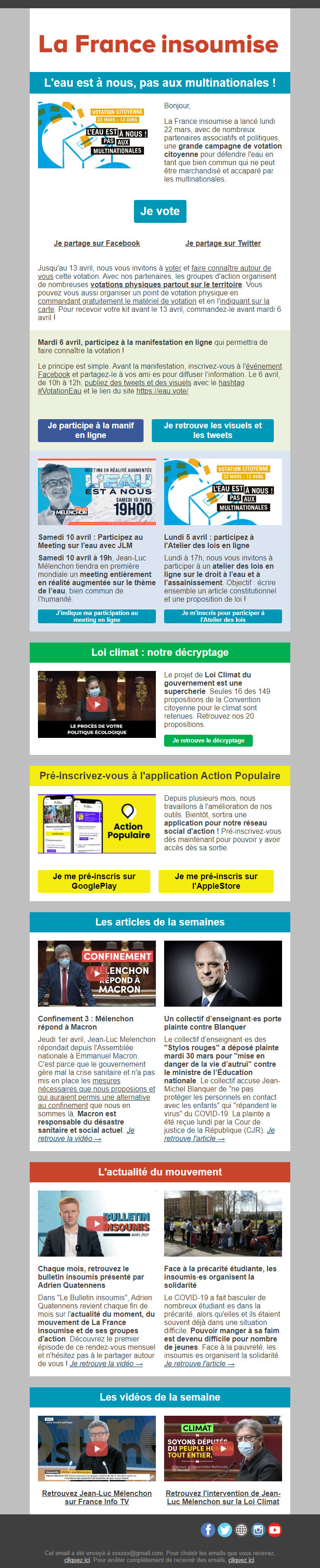
The email is long and contains a lot of text, but at least it has a CTA button at the very beginning. The interested users can use it without reading the whole email. There aren't many people so engaged to carefully read the whole text. The button at the beginning gives people an opportunity to help the party: do the thing they are expected to do without engaging with a large text.
Some news is placed in two columns to shorten the height of the email. It feels like the email has some problems with the interline spacing: the lines seem to stick to each other. The important info is in bold type, but there is so much of it, that it becomes an indistinguishable mass. When everything is important nothing is important. Captions on some of the buttons are too long, so they don't resemble buttons anymore:

It feels like the email breaks off mid-word at the end: the news and then the footer.

This email needs a complete redesigning, just like the German one. It has problems with accents, readability, and the number of colors. Shorter emails by this party look way better:
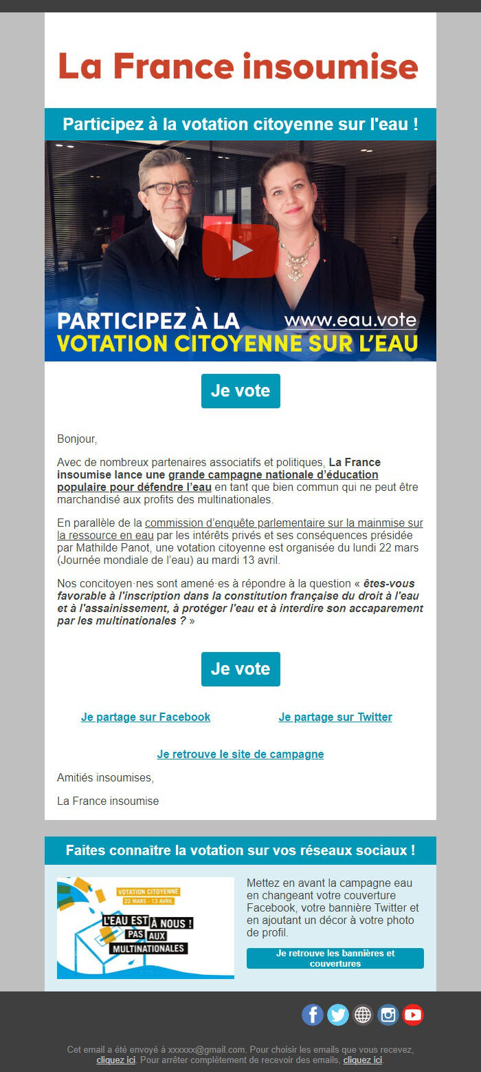
There are two CTAs at the beginning and the end of the email. Sometimes it is done for a person not to scroll back to the beginning after reading the email. But in this case, it seems out of place — there are three text passages between the buttons, which may take only one screen on some devices. One button at the end would be enough.
We don't have any special requirements for the design of a political email newsletter. It must inform people and help the party communicate with its supporters — there is no need for incredible design solutions. Clean and neat text with a clear action at the end is already a reason to praise the campaign. Yes, any newsletter can be improved: e.g., by experimenting with email design or making and testing hypotheses. But sometimes all you need is to do everything well and to clearly stand out from the opponents and communicate with your supporters.
If you want to be the first to learn about other examples of good and bad campaigns, no matter whether they're political or not, subscribe to our newsletter. The subscription form comes right after the article.


